
Creating and scaling a playful & modern pediatric care brand
Brave Care is a pediatric health care startup with a mission to help every child reach their full potential. Over the past 4 years, we’ve experienced remarkable growth, expanding from a small team to over 100 employees. Through successful funding rounds, we transformed a single clinic into a nationwide network of five, and delivered a range of products and software that power our clinics. As we ventured into new cities and services, maintaining a strong and flexible visual identity was important to evolve and continue to reflect the highly personalized essence of our brand.
In 2019, I joined the team as the founding designer, collaborating closely with the founders to establish the Brave Care brand and identity system from the ground up. We aimed to create a modern, sophisticated, yet approachable brand that aligns with the exceptional care experience in our clinics. Over the years, I’ve had the privilege of working on a vast range of projects spanning product, marketing initiatives, environmental design, and even swag. From laying the foundation to securing $43 million in funding, I have contributed to nearly every touchpoint of the Brave Care experience, ensuring that our brand consistently exemplifies the excellence and compassion we bring to the children and families we serve.
Client
Brave Care
Date
May 2019 - Present
Role
Art Direction, Photography Direction, Visual Design, UI / UX
Deliverables
Logo and visual identity
Brand guidelines
Website design
Interior design
Environmental branding
Marketing collateral & swag
The Brave Care logo
When developing the Brave Care logo, we set out to create a symbol that effectively represented both medical care and the concept of bravery.
Being brave entails embracing new and challenging experiences, even in the face of fear. We want our community of children and parents to understand that it's OK to feel scared. It’s OK to get hurt. It’s not OK to allow fear to hinder them from exploring, learning, and taking risks. Although they may fall, get bumps and bruises along the way, brave kids will get up and try again.
We threw around ideas inspired by badges of bravery, such as bandaids, patches, capes, and gold stars. However, we aimed to strike a balance between capturing the essence of courage and adventure while avoiding a literal representation that may limit our potential to grow as a company. The mark had to embody the spirit of adventure and symbolize courage. That’s how we arrived at our flag mark—a guiding beacon that represents our commitment to fulfilling our mission of helping every child reach their full potential.


Brand foundations
Typography
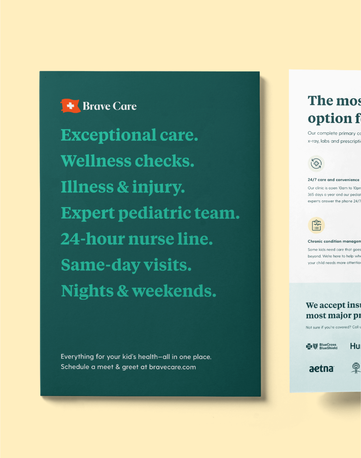
We use two complementary typefaces to express our written messages, establish visual hierarchy, and ensure consistency across various mediums. For headlines, Tiempos is an elegant yet unpretentious serif typeface that strikes a balance between sophistication and approachability. Greycliff, a round and friendly sans-serif, adds a touch of warmth and accessibility to our longer-form content.

Color
To communicate both pediatrics and tech-forward healthcare startup, we curated a color palette that balances trustworthiness and playfulness. Our primary color, Dark Harbor, feels familiar and evokes a sense of calm. Complementing it is our secondary color, Bright Teal, which adds a spirited and modern touch.
For our accent colors, we drew inspiration from the vibrant and varied hues commonly found in children's artwork. These bold and pastel tertiary colors add vibrancy and diversity to the brand.
For backgrounds, we use neutral tones of beige, white, and grays to create whitespace and provide clarity in our communication.
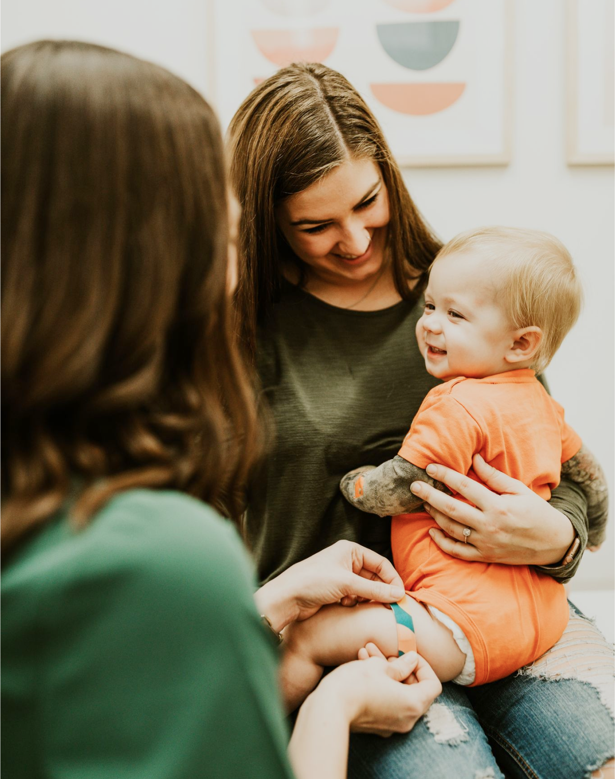
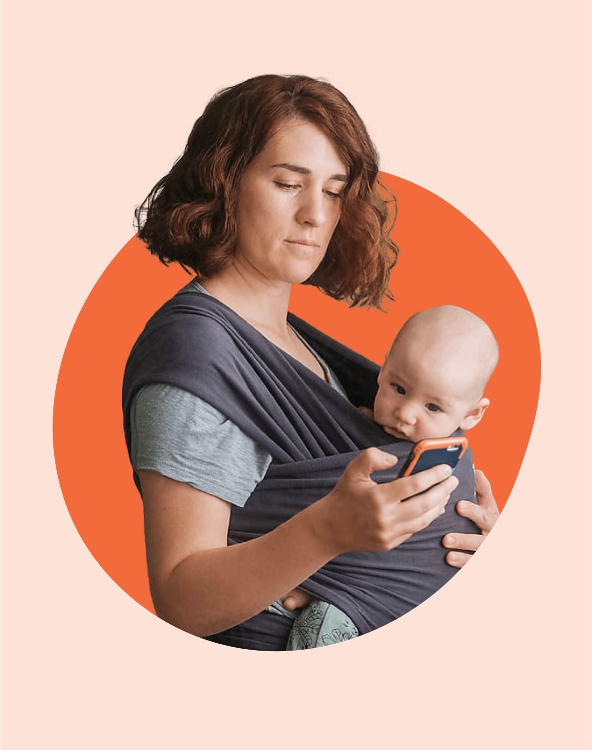
Photography
Our photography helps us build an emotional connection between Brave Care and our patients. It allows us to authentically showcase the incredible individuals who contribute to the exceptional healthcare we provide and the customers we serve. We accomplish this through warm tones and capturing genuine emotions and body language.


Mascots
Our characters are cute and beloved—especially to our patients and internal team! They often get a starring role in our marketing and swag materials.
Scout, the fox, is the leader of the Brave Pack, a friend to all, and the official Brave Care mascot. His friends are supporting characters that help convey a range of emotions or actions for education, encouragement, or bringing smiles for kiddos.


Blubs
To tie everything together, we created our own version of organic blob shapes, named Blubs after our CEO Darius ‘ Bubs’ Monsef. They are used to add elements of playfulness and spontaneity to an overall minimal aesthetic by adding depth to our backgrounds, highlighting something important, or masking hand-drawn patterns or photography.

The result is a comprehensive, expressive, and felixble foundation for the brand that can grow and evolve with the company.

“Cindy is incredible. She was our first hire and has been the DNA that has made the Brave Care brand and creative work so strong.”— Darius Monsef, CEO and Founder, Brave Care
Applying the brand
Brave Care website
Our expansive and flexible website system, consisting of slices and a custom visual library, enables us to maintain brand consistency, design at scale, and create on-brand pages quickly.


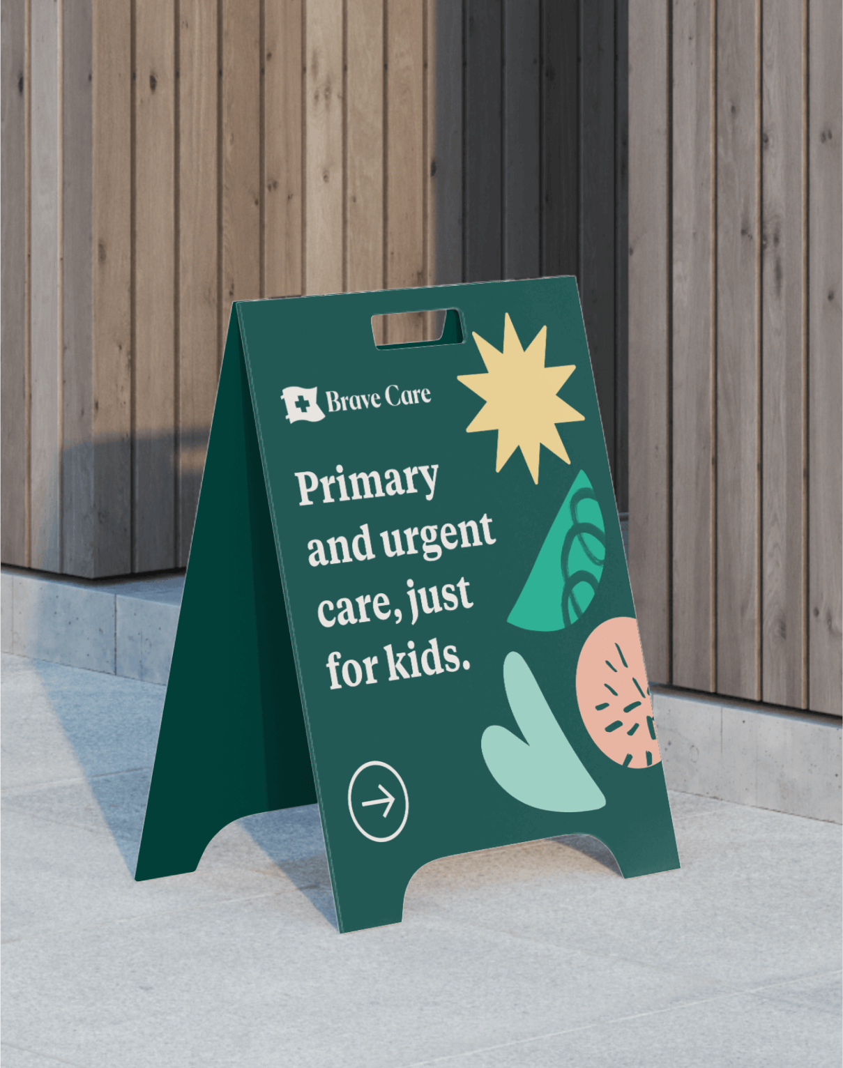
Environmental branding, interior design and styling
Our mission and vision revolve around the belief that every child deserves the best care—regardless of their circumstances or the purpose of their visit. To ensure that we can fulfill our mission and vision, it was important that our physical spaces made every parent and child feel welcome, comfortable, and safe.
All of our clinics follow the same approach and ingredients for an inviting space: These include open waiting areas, intimate personal and private spaces, natural lighting, the use of honest materials, and inclusive signage. In collaboration with the expansion team and under the creative guidance of Noah Stokes (refer to his case study: "How We Crafted the UX for Children's Health Clinics"), I was responsible for selecting furniture, fixtures, and decor, as well as providing creative direction for the unique mural in each clinic.


We worked with local artists to showcase their work as a mural in our clinics. Not only does this help promote the beauty of art and creativity, but also creates an environment that sparks the imagination of our young patients. It is a reflection of our respect for the community and new neighbors. Each clinic features a unique mural that captures the essence of the neighborhood in the artist’s personal style.

Mural by Will Bryant located at Brave Care Circle C, Austin, TX

Mural by Jacob Greif located at Brave Care NE Sandy, Portland, OR

Mural by Variety Shop located at Brave Care Sellwood, Portland, OR

Mural by Bronwyn Gruet located at Brave Care Cross Creek, Fayetteville, NC
Mobile clinic van
During the COVID-19 pandemic, we launched a mobile clinic to offer pediatric primary care services and vaccination pop-ups to our community who may have limited access to quality care.


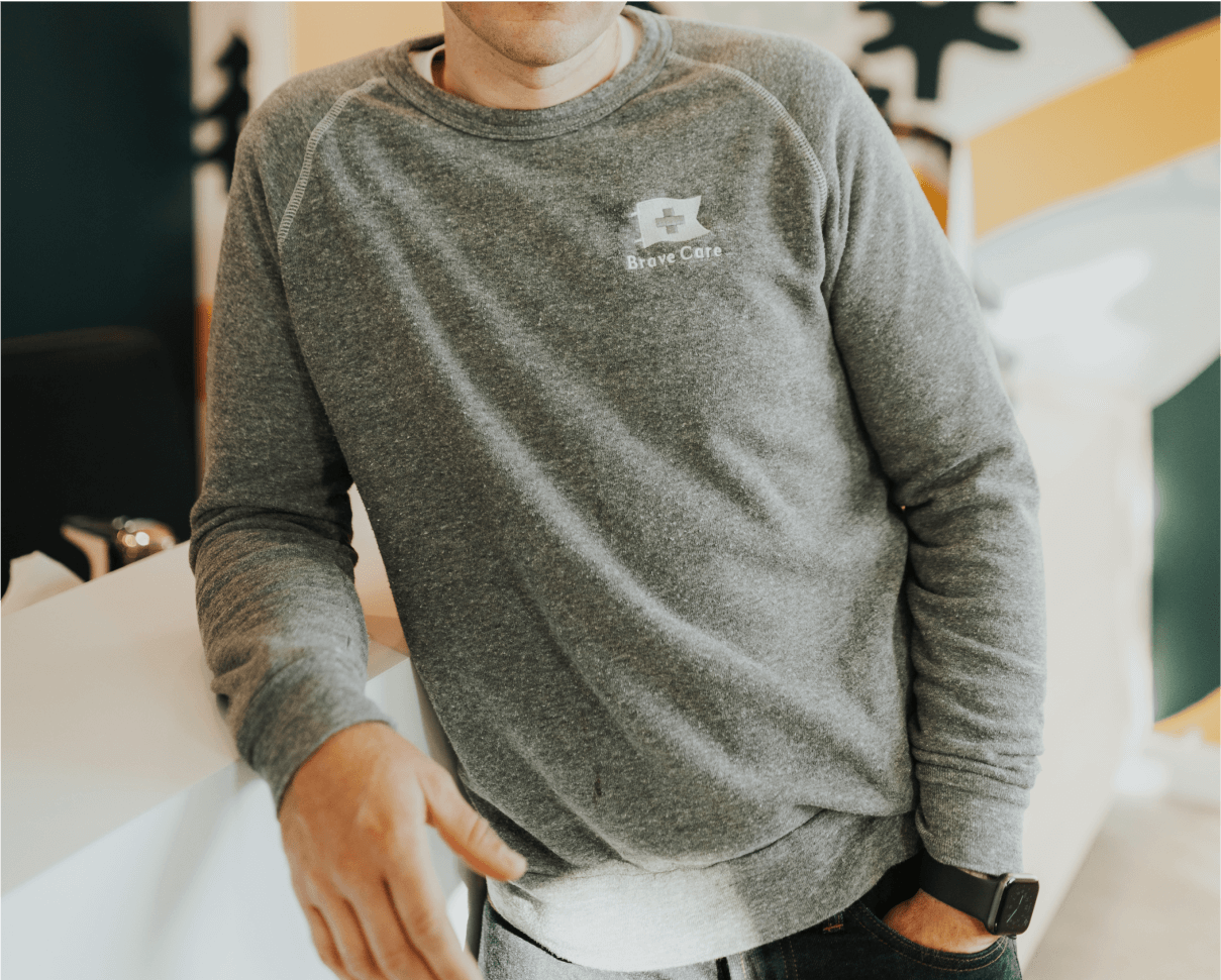
Swag
To foster belonging and team pride, we curated a special care package for all staff members as part of their onboarding process. I designed a custom package that reinforces Brave Care’s mission and vision and sourced the beautiful and thoughtful items inside.


Credits
Ali Rae Photography: Clinic photography & headshots
Alfrey Davilla: Mascot illustrations
